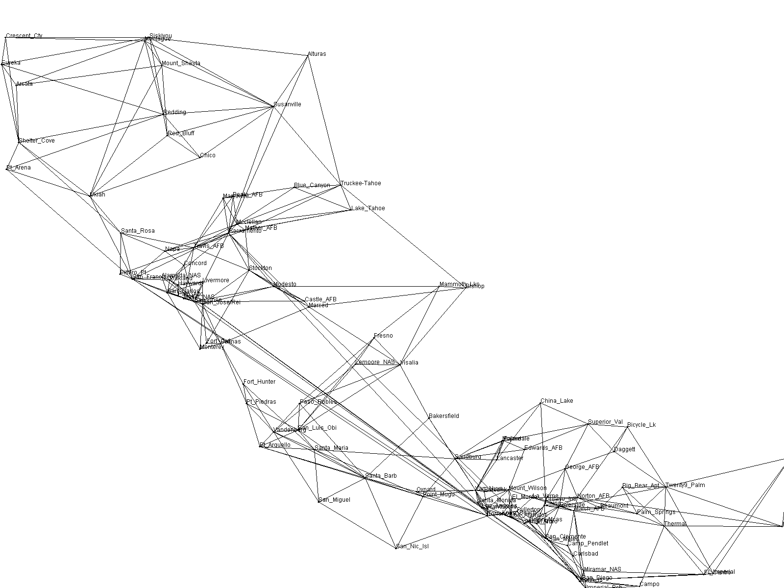
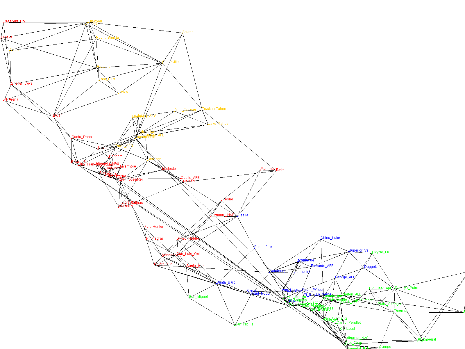
In this experiment we try to identify hubs in the map by degree. After the hubs have been identified, we group the remaining nodes by which hub each is closest to. We determine closeness by running Dijkstra's shortest path algorithm from each node to each of the hubs, using the travel time for an edge (distance/speed)as the edge weight. The node is grouped with the hub that can be reached in the fastest time.
We then color each groups' nodes differently. We also determine the hubs' relative locations, i.e., which is most northeastern or southwestern, for example. We use this relative location information to add a constant factor to the coordinates of each node in a group to separate the groups from each other.
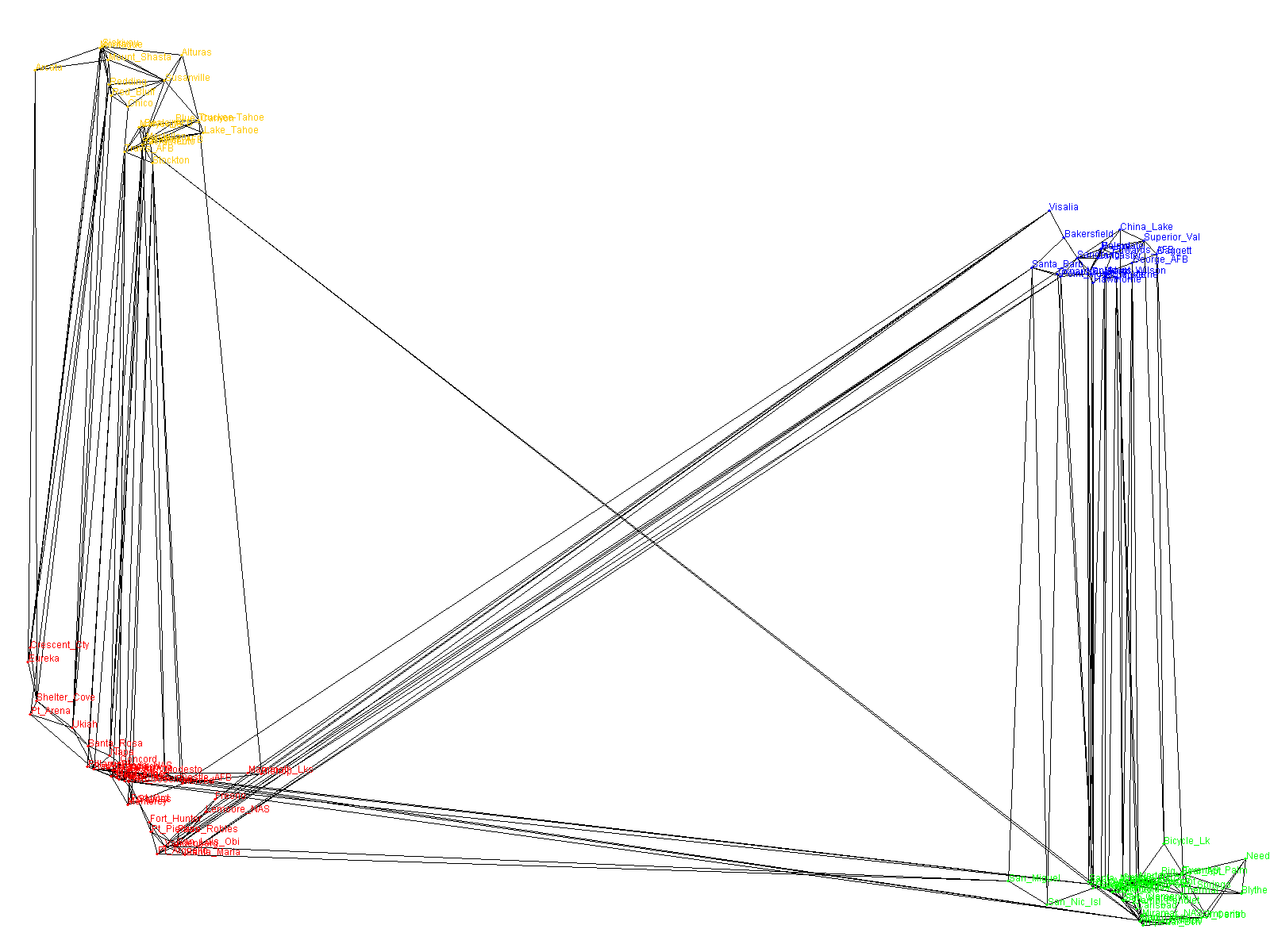
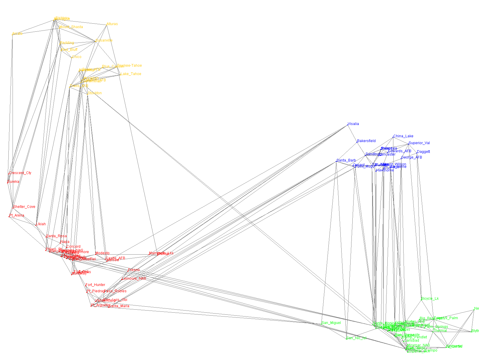
If expanding each hub and pruning and/or emphasizing edges is incorporated with hub separation it may be a viable strategy for depicting map information when hubs are connected via only a few links. As we see in this example, however, dealing with the connections between nodes on the fringes poses a challenge, since they emphasize slower connections between less important nodes than the important hub connections we are trying to show.
After showing this map to a non-engineer, the feedback I received was, "I preferred the map that looked like the California coastline since I knew where things were." Perhaps when representing realworld locations, extreme distortion is not desirable, but there may still be a place for discovering hubs and grouping nodes around them even if we decide not to use the separation strategy depicted here.
Created on October 11, 2004.
John Cieslewicz/johnc@cs.columbia.edu